INSPIRATION
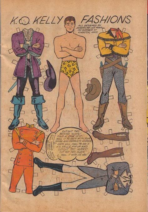
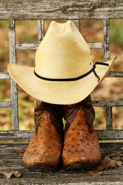
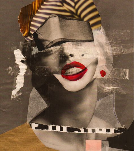
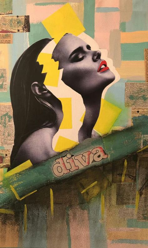
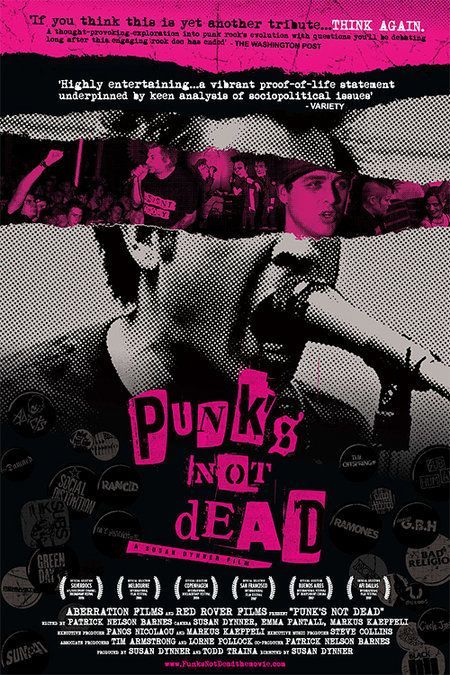
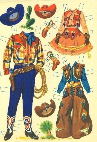
The creative team for COWBOY BOB had created a "mood board" (via the incomparable Pinterest) for their production at the Alley Theatre in Houston. This board was shared with me with a little extra context from the producing team. The interesting thing about designing a logo for a musical or other production is that it will live in multiple spaces and likely won't stay as the final design, but if a team is able to conquer their visual language early, they can translate it as the show moves from their first venues on to their final home.
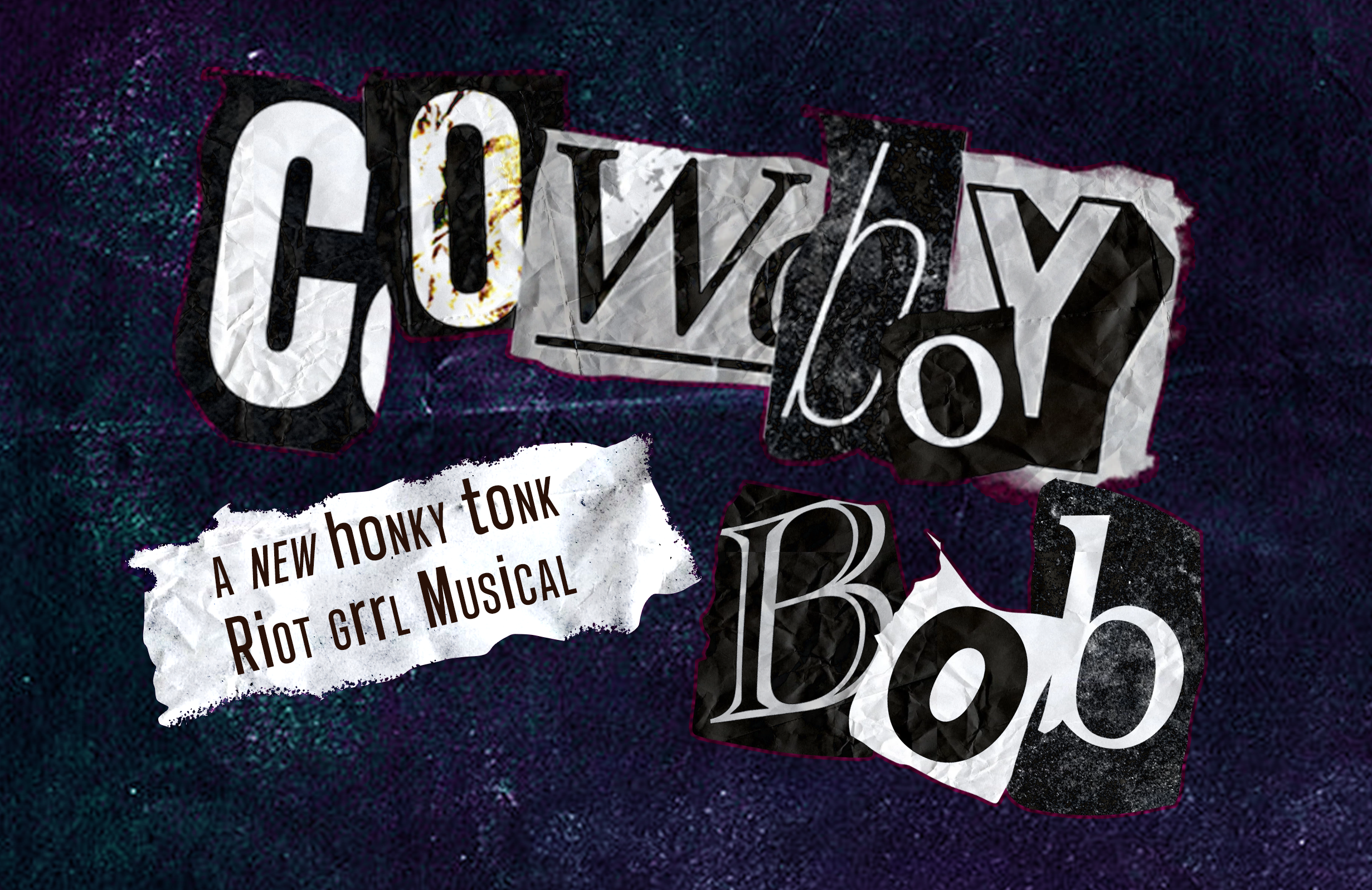
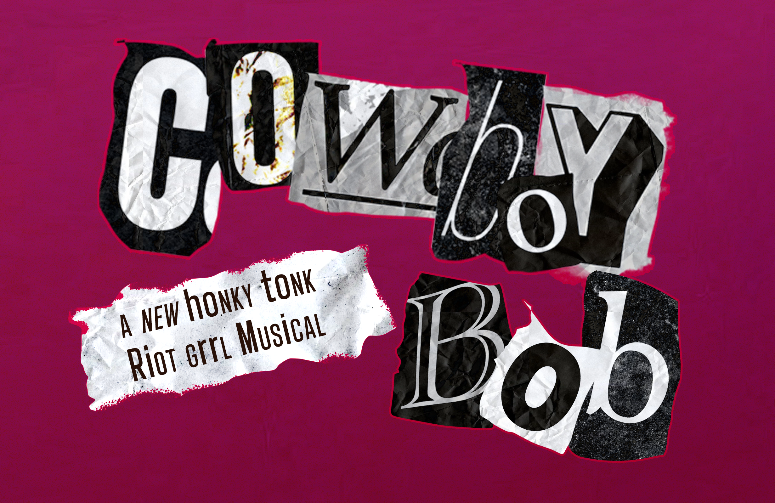
These designs were purely conceptual. Only the collage logo and type was used in any official capacity.
FINDING THE LOOK
I began by designing four options. I kept digital spaces in mind since this design would live more comfrotably online as the Alley has their own marketing team.
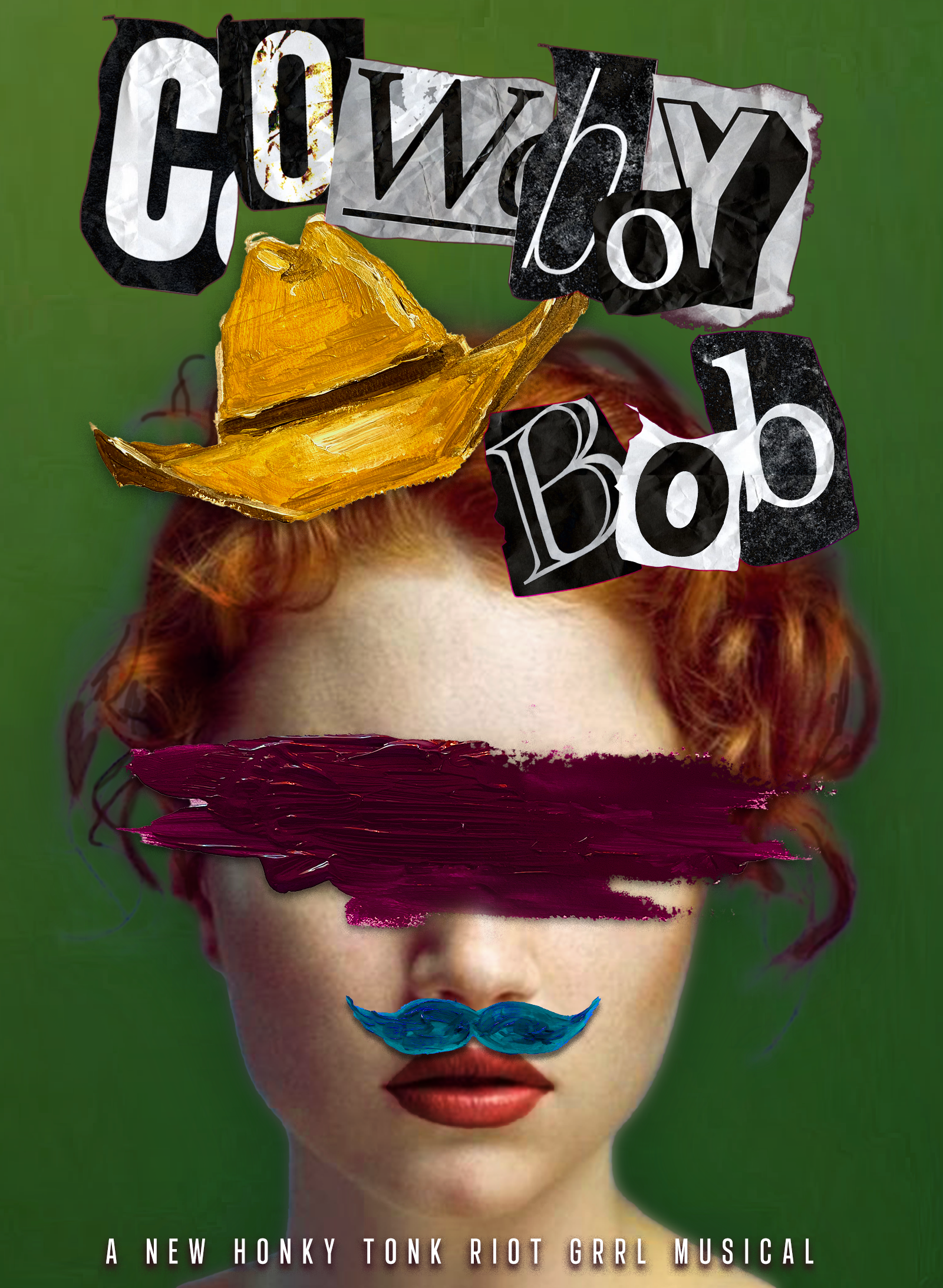
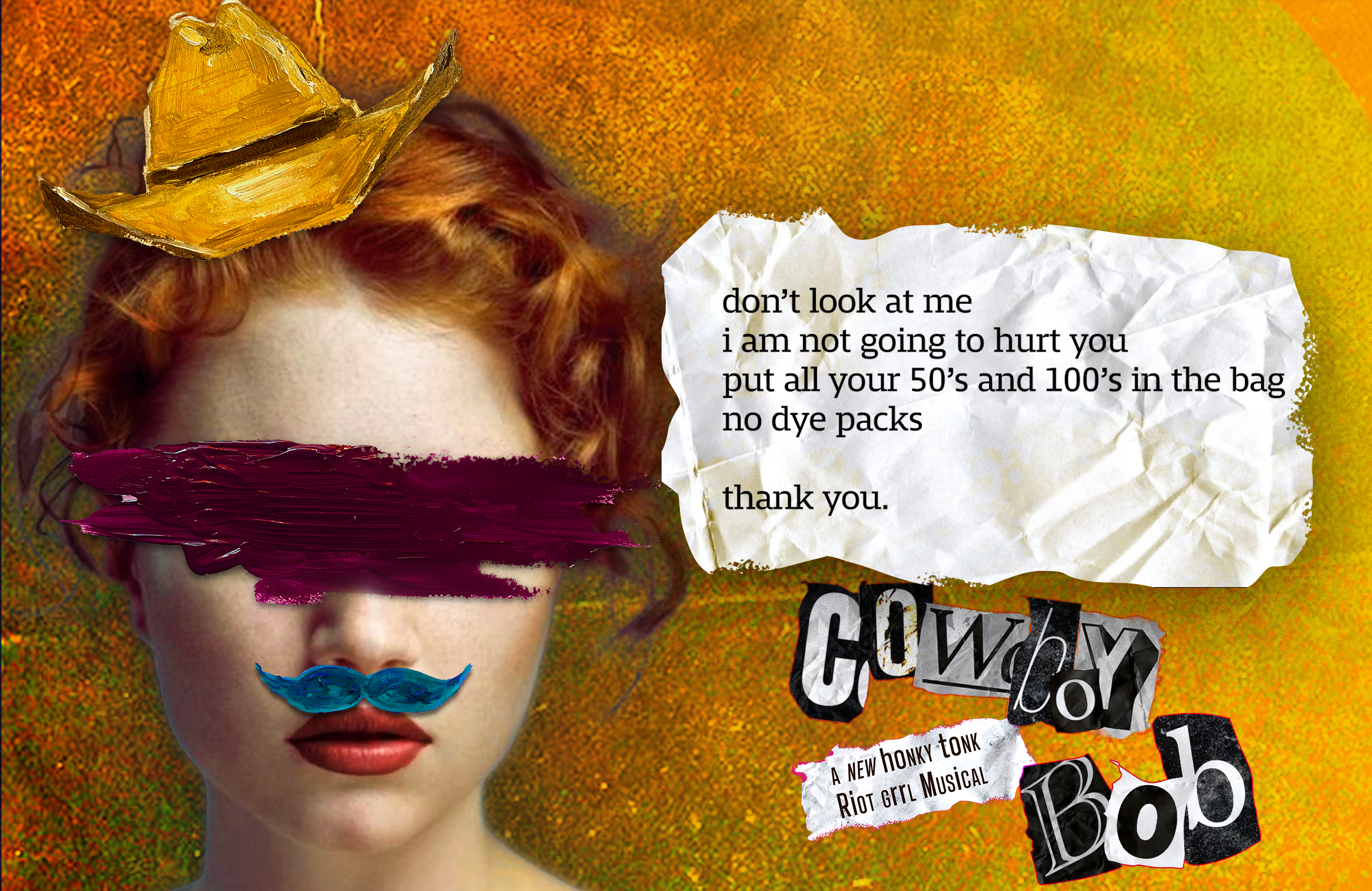
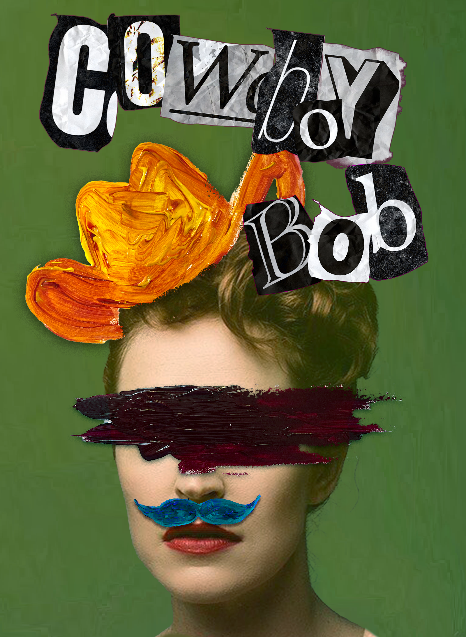
Wild Post
Artistic, Playful, Whimsical.
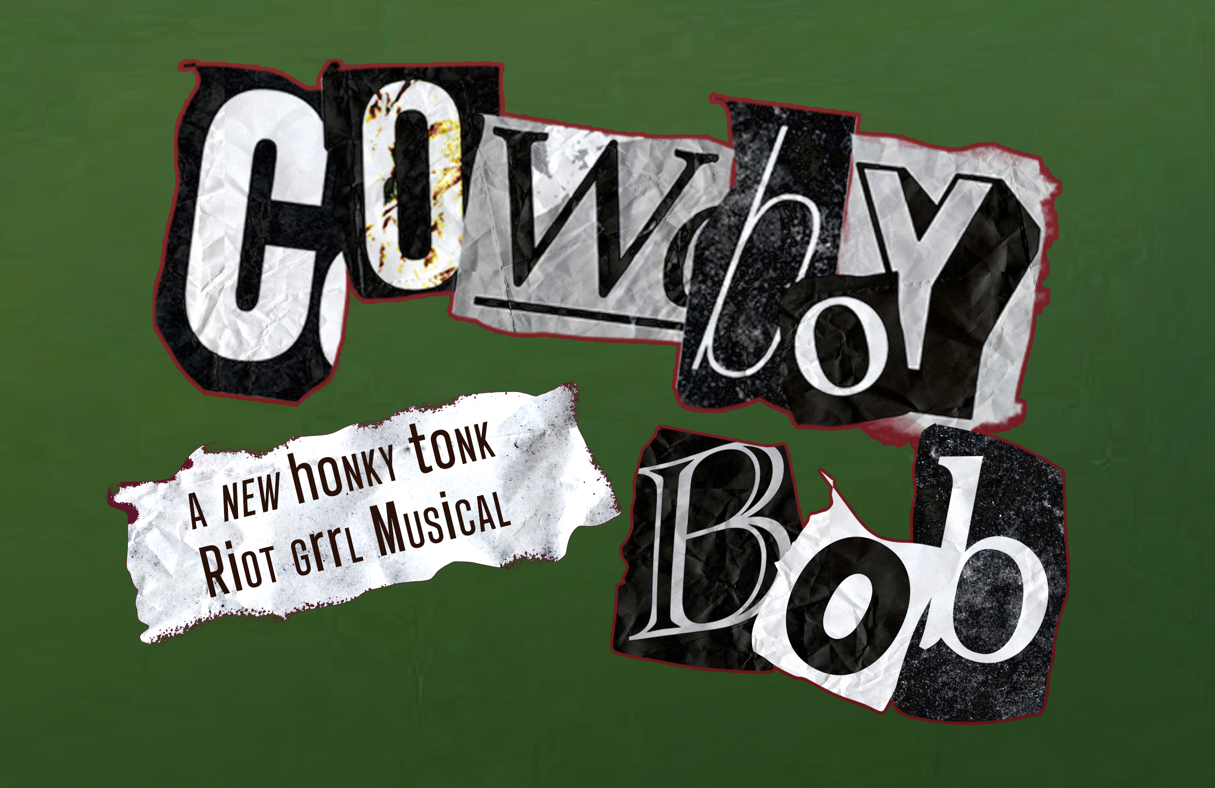
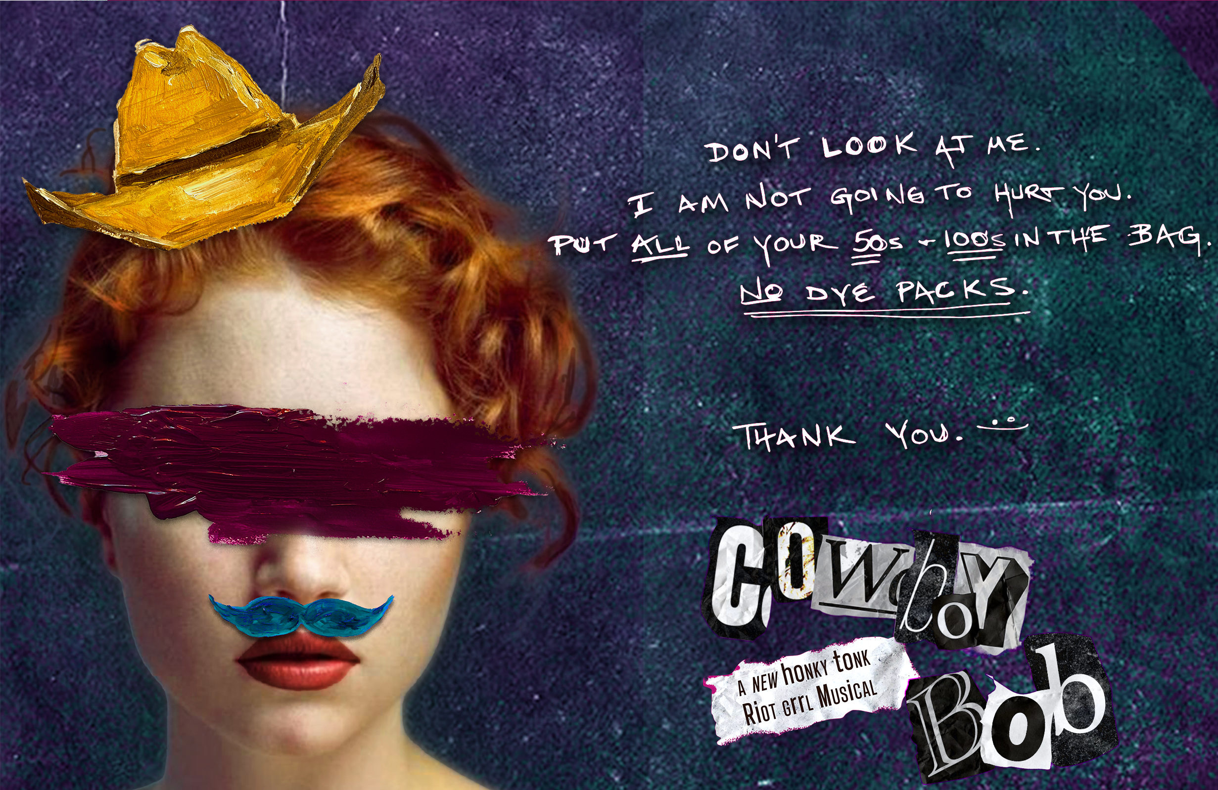
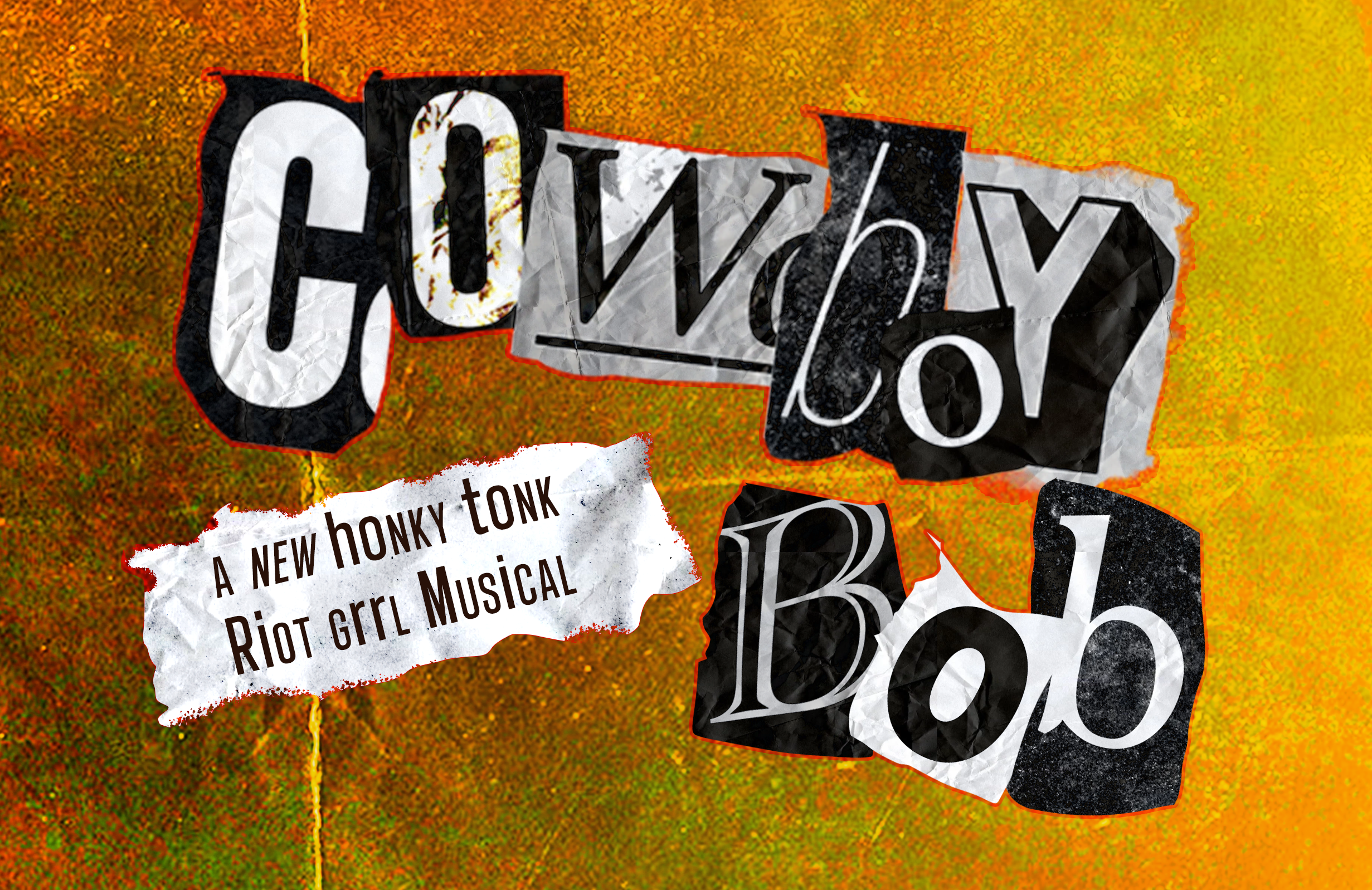
Place femininity at the top of the list, but juxtapose it with the “painted on” facade imbued in the “Cowboy Bob” persona. The cut-out collage appearance of the typography lends itself to the familiar trope of the ransom note, but also evokes a sense of punk anarchy. The playfulness and energetic tone make for striking imagery against the often bland and even more often tame theatre marketing space
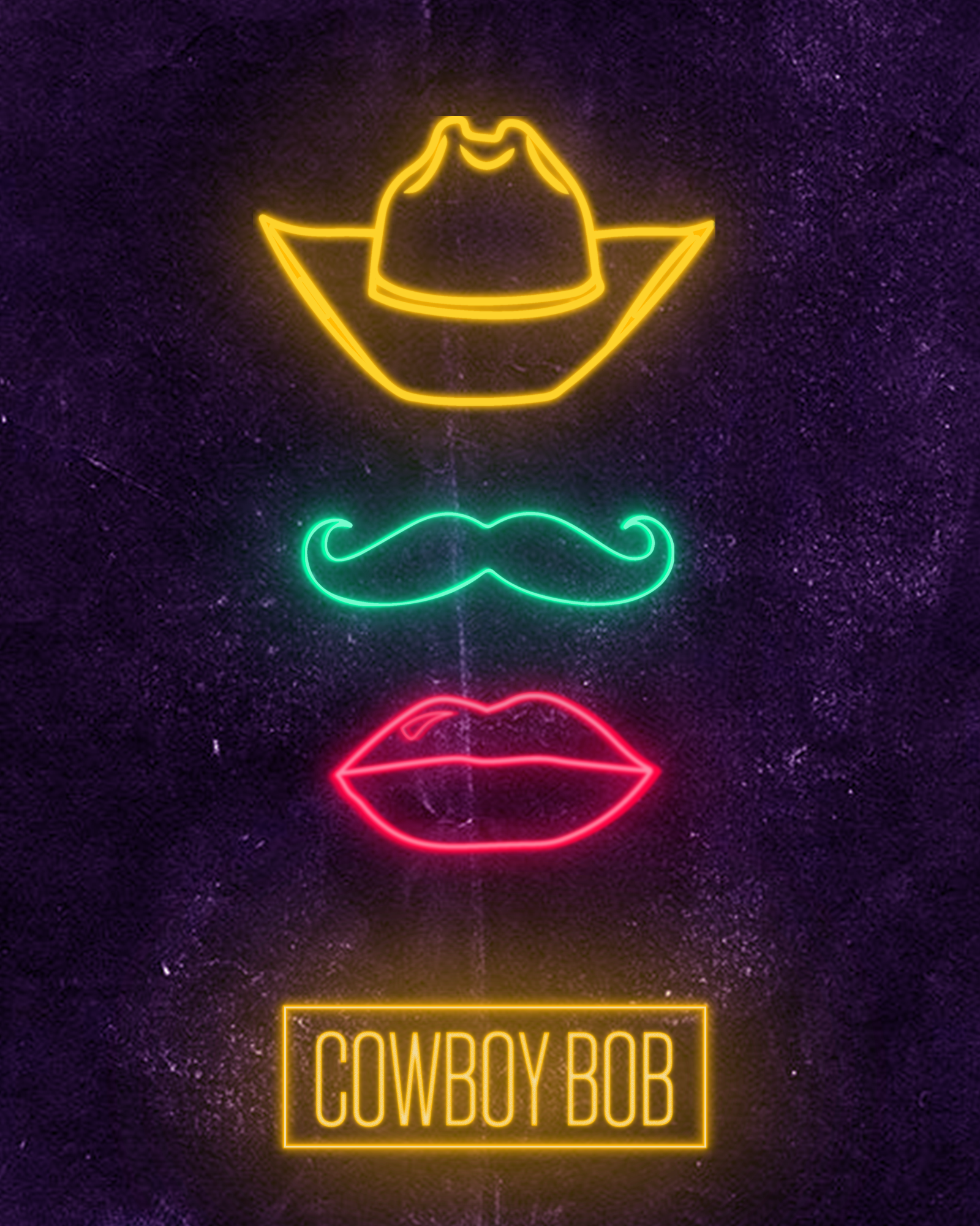
Neon Moon
Modern, Iconic, Eccentric.
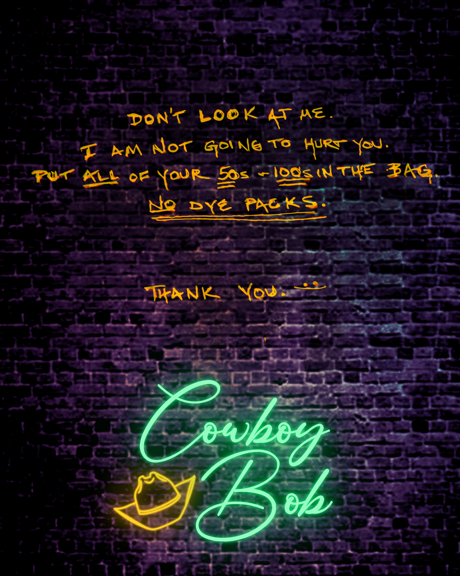
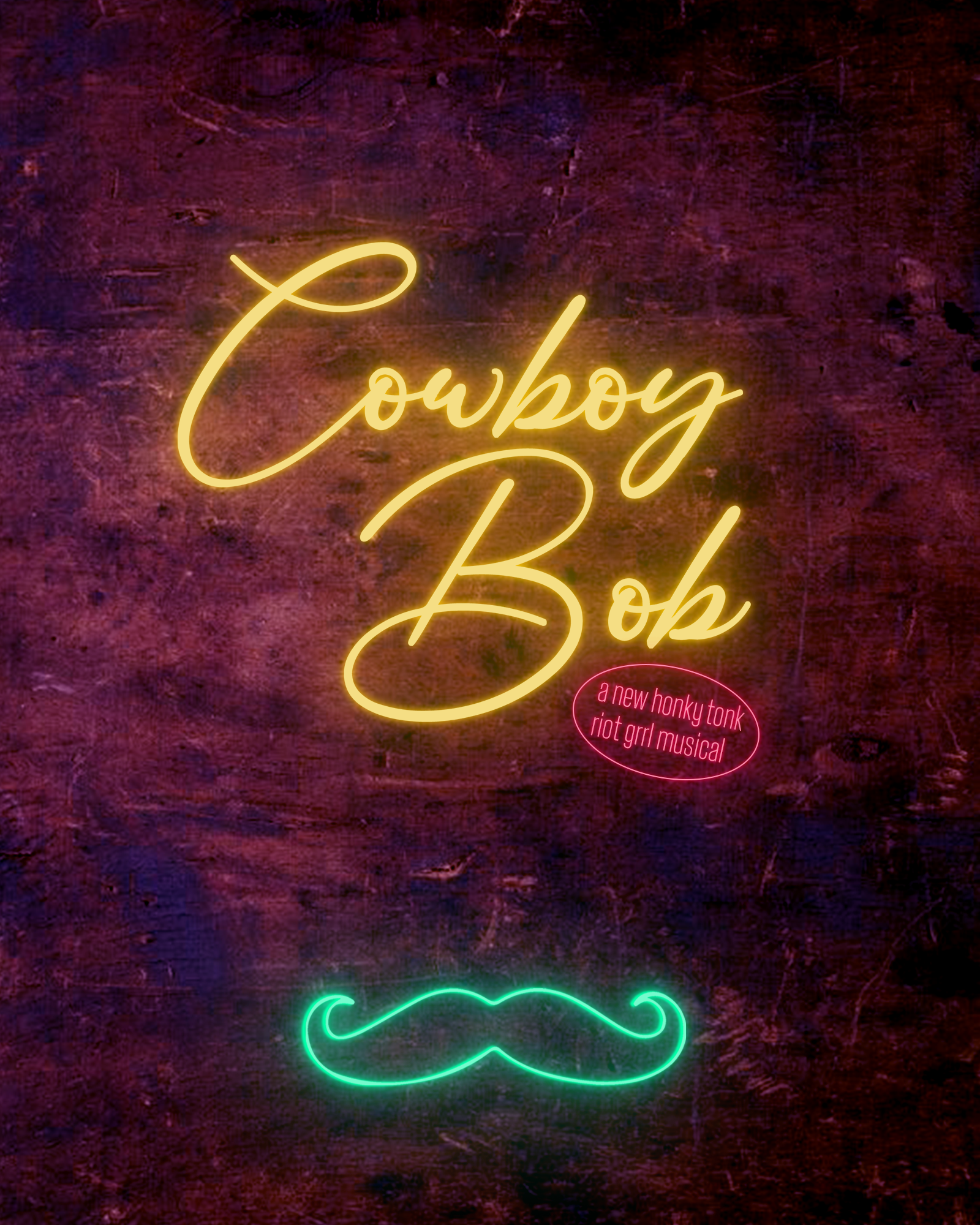
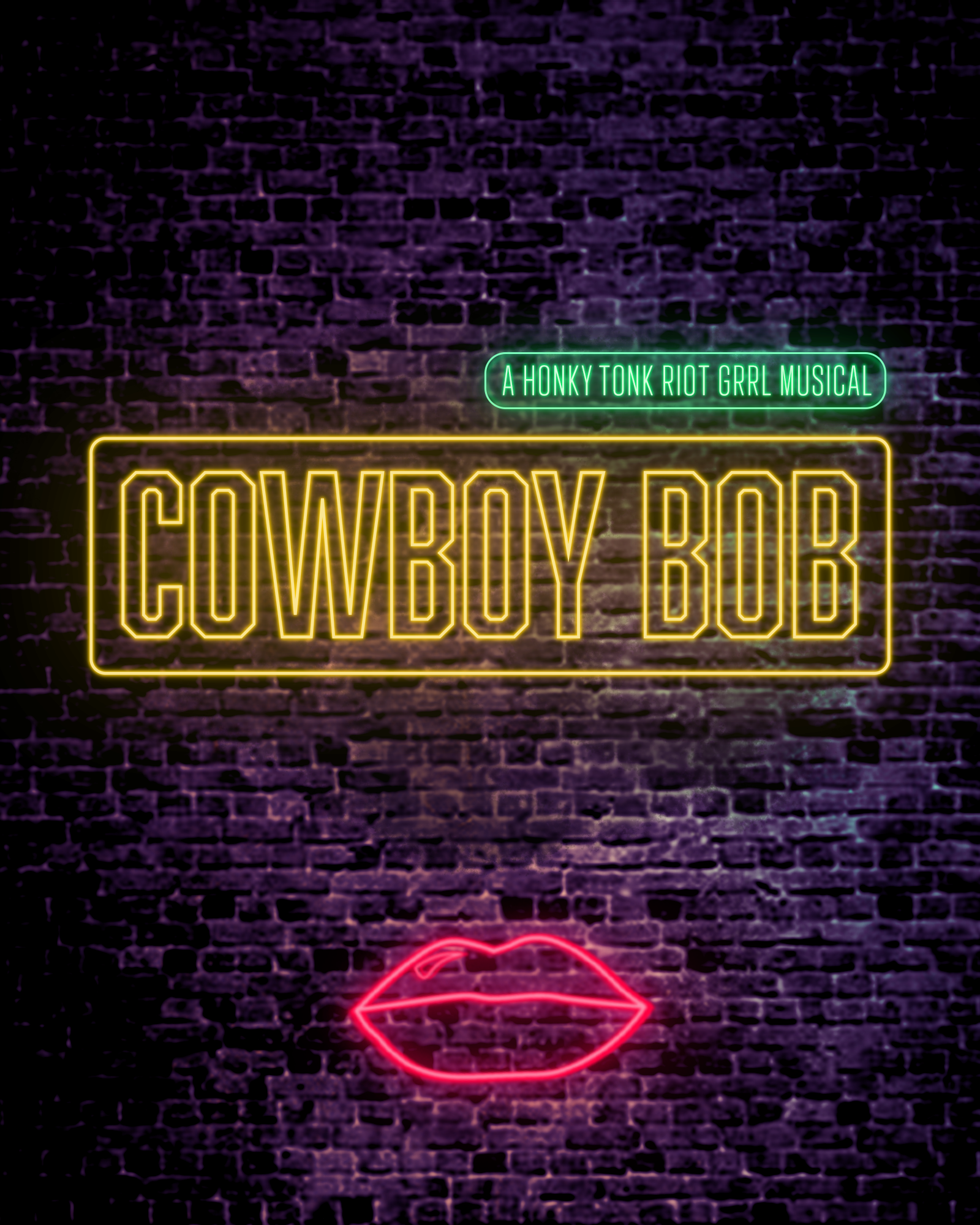
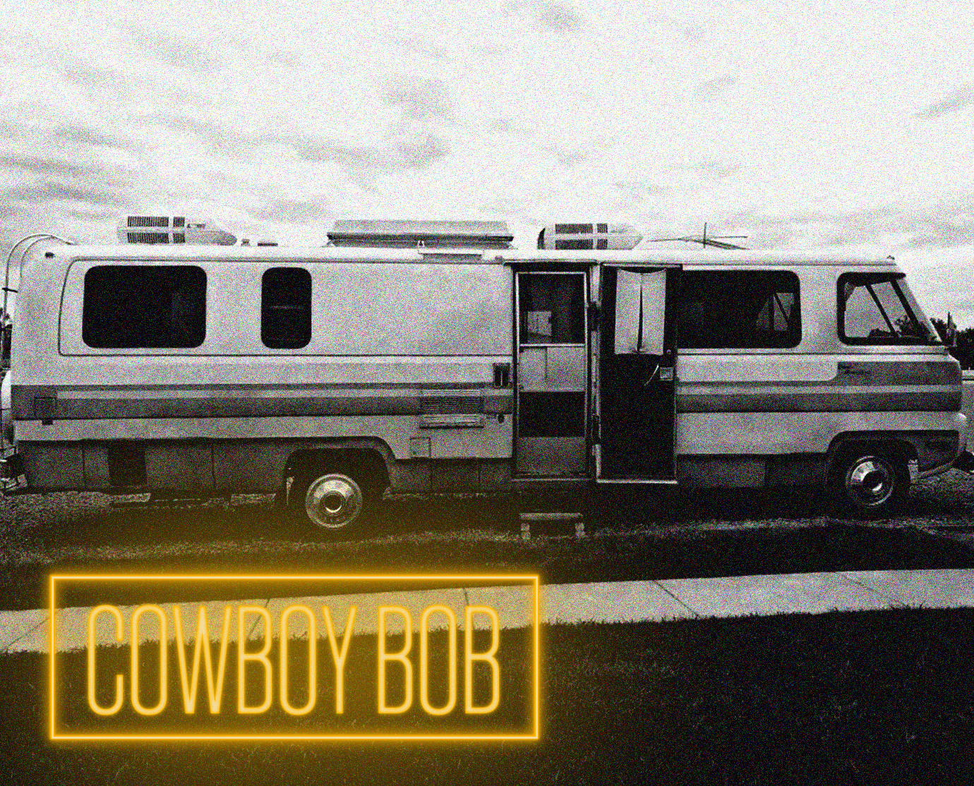
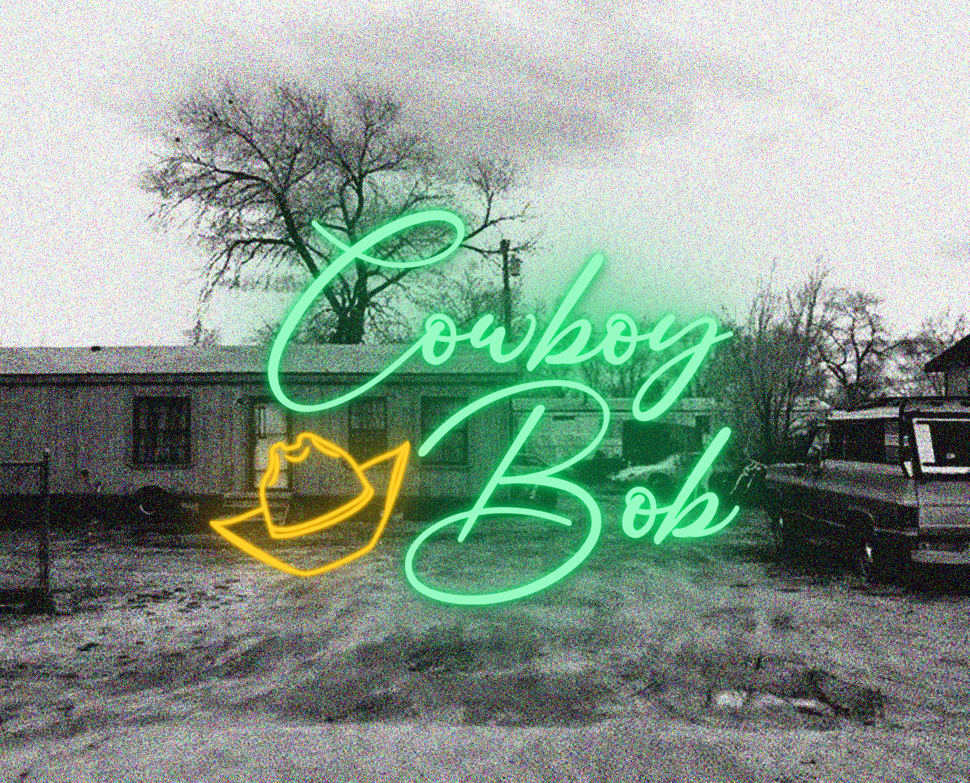
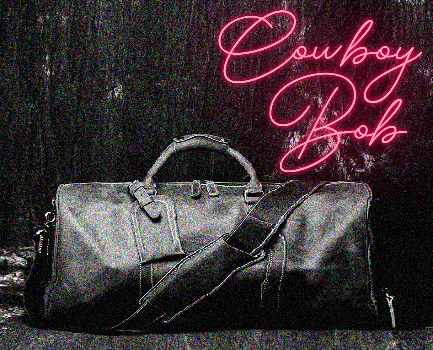
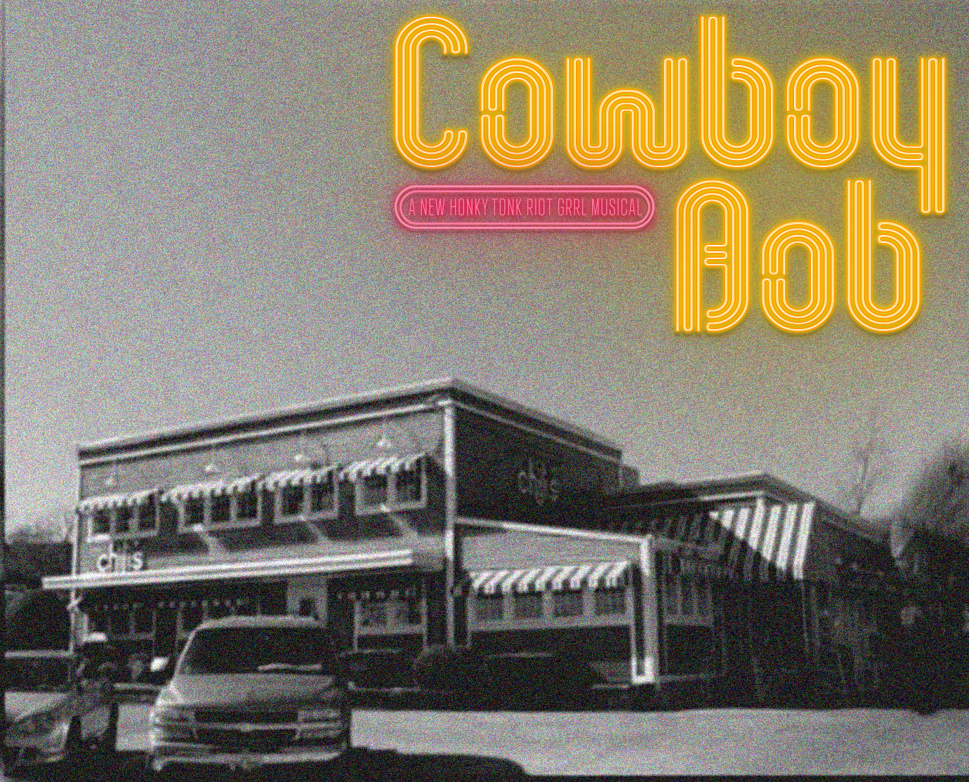
Use the tried and true neon sign motif to create a series of icons that represent the core of “Cowboy Bob”. The icons are then used alongside gritty black and white photos of various settings in the musical. The juxtaposition represents the idea of Cowboy Bob becoming a “light” or “sign of change” in the banality of smalltown Texas existence. WW
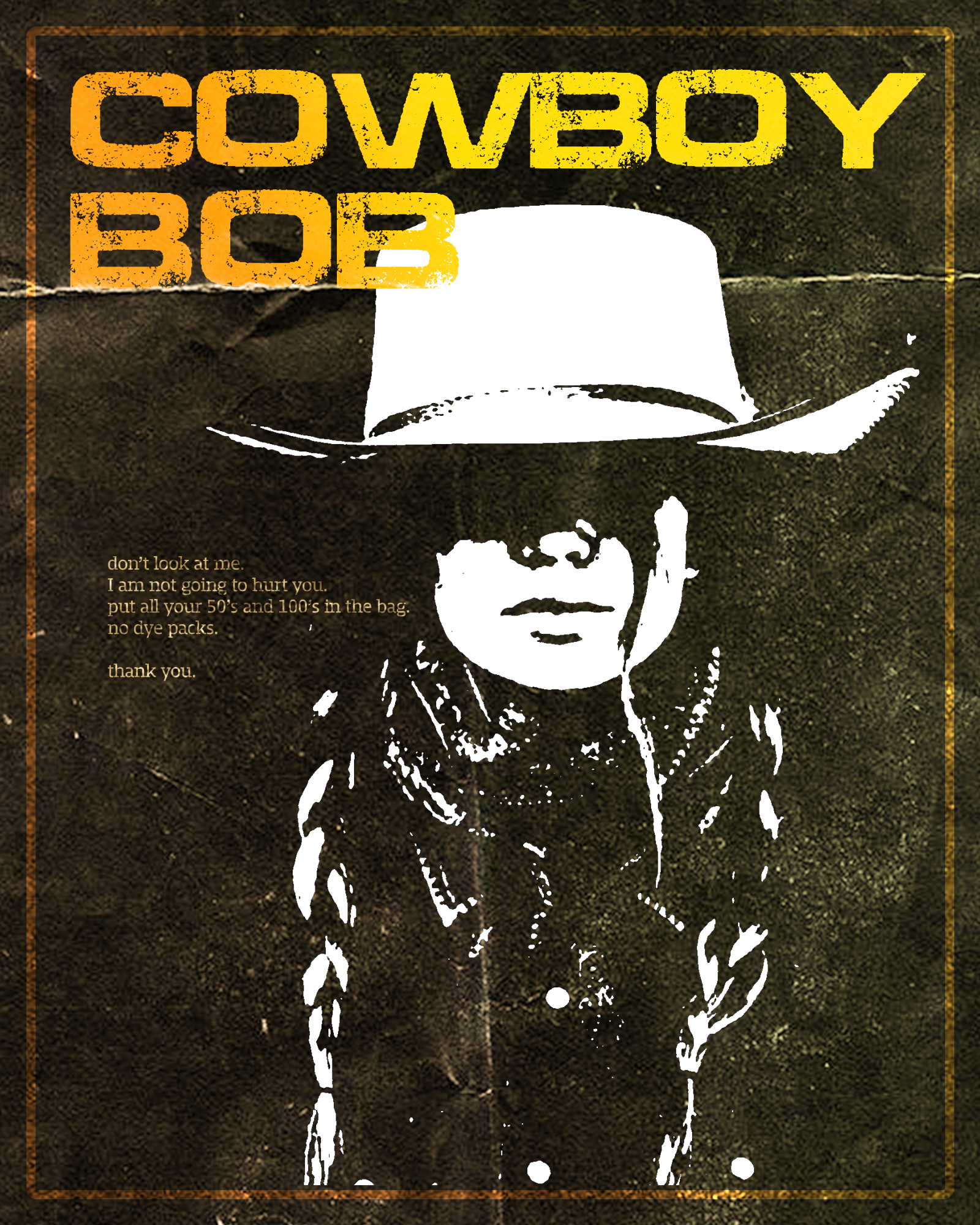
Modern West
Strong, Powerful, Earnest.
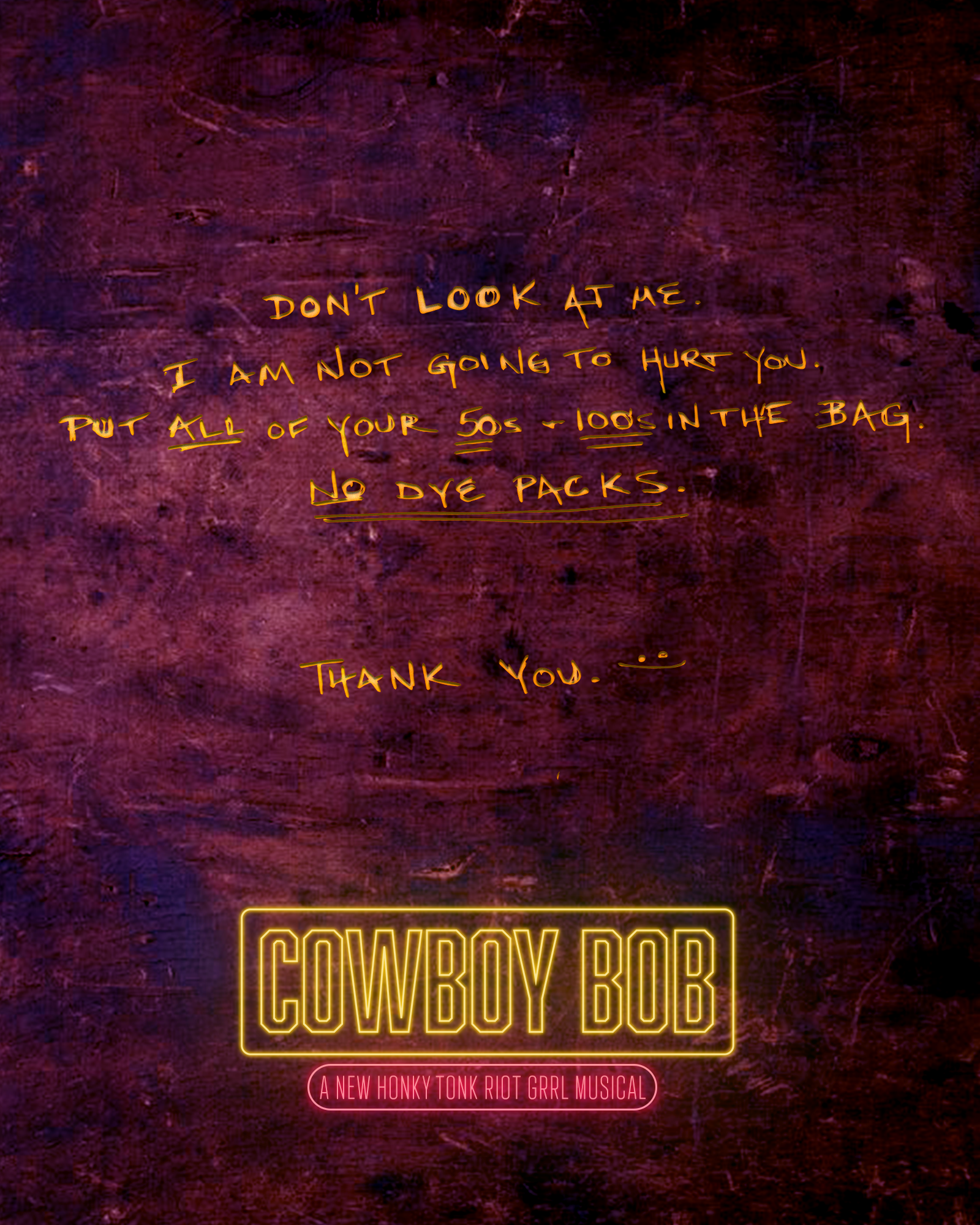
This is the forthright and confident representation of the legendary outlaw. We know who she is and what she is about. This could serve as the album cover posted in a punk-rock honkytonk. We utilize the infamous note Bob employs at each heist as legendary script. Campaigning is earnest, edgy, and imbues strength.
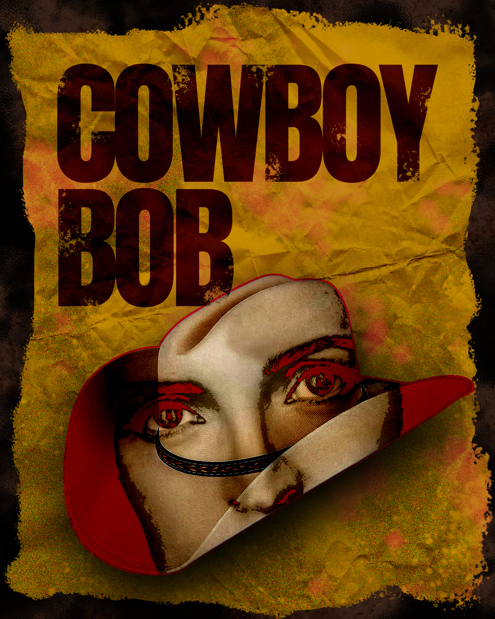
Old West
Bold, Classic, Recognizable.
Play with the iconic image of the cowboy hat paired with the femininity of a woman’s eyes (in this case Grace’s). This concept draws on the “wanted” poster we are all familiar with while slightly modernizing it. This visual language makes for easy utility across multiple outlets (eg. social, printing, etc.)
REFINING
After my first proposal and notes, we landed on the "Wild Post" and "Neon Moon" as the directions we wanted to pursue. We had another round of edits and then we decided on these as our final designs. As these designs were to morph in the future, my package of deliverables featured many varying looks and ideas for the producing team to play with ahead and after the Alley production.
NEON MOON (Final)

DAC: ALEXANDER CRAWFORD
PHONE: 918.845.1838
EMAIL: alex@dacrawford.com
INSTAGRAM: @dacpickle
©DAC: ALEXANDER CRAWFORD

